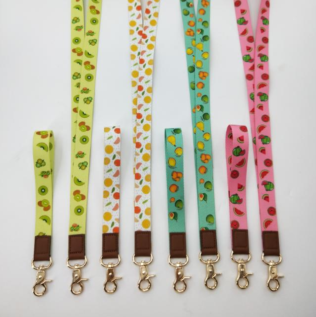
ODM Fashion Lanyard Designs That Elevate Everyday Branding
2026-11-17
Most lanyards do their job quietly—holding badges, keys, or IDs—but the ones worth remembering do far more. They turn a simple neck strap into a walking billboard, a conversation starter, or a subtle brand signature that lingers long after the handshake. At DONGCHUANG, we see ODM fashion lanyard designs as the overlooked detail that can sharpen everyday branding without shouting. If your current lanyard feels like an afterthought, here’s how a smarter design can change the way people see your brand—one wear at a time.
Rethinking the Everyday Lanyard as a Brand Surface
The lanyard usually gets treated as a cheap afterthought: a woven strip with a logo slapped on and handed out by the hundred. But that overlooks how often it appears in real life. It hangs at chest height, moves with the wearer, gets touched during badge scans, and shows up in photos taken at conferences, campus events, and building lobbies. Few other branded objects spend that much time in someone’s personal space, which makes the lanyard quietly more intimate than a poster, a tote bag, or a booth backdrop.
Rethinking it as a brand surface means moving past loud repetition. The material, edge stitch, buckle finish, and cord texture can carry identity just as clearly as a printed logo. A matte cord with contrast stitching reads differently from a glossy woven strap. A small debossed metal clip or a subtle end-cap detail gets noticed because people fidget with these parts. In close view, those choices feel less like advertising and more like a considered object.
The practical shift is that wearability becomes part of the brand message. A lanyard that feels smooth around the neck, stays lightweight, and clips easily is more likely to be kept after the event. When that happens, it leaves the convention hall and enters commutes, offices, and everyday routines. The brand then travels through ordinary settings not as a giveaway, but as a small piece of someone’s daily carry.
Material Choices That Do More Than Hold a Badge
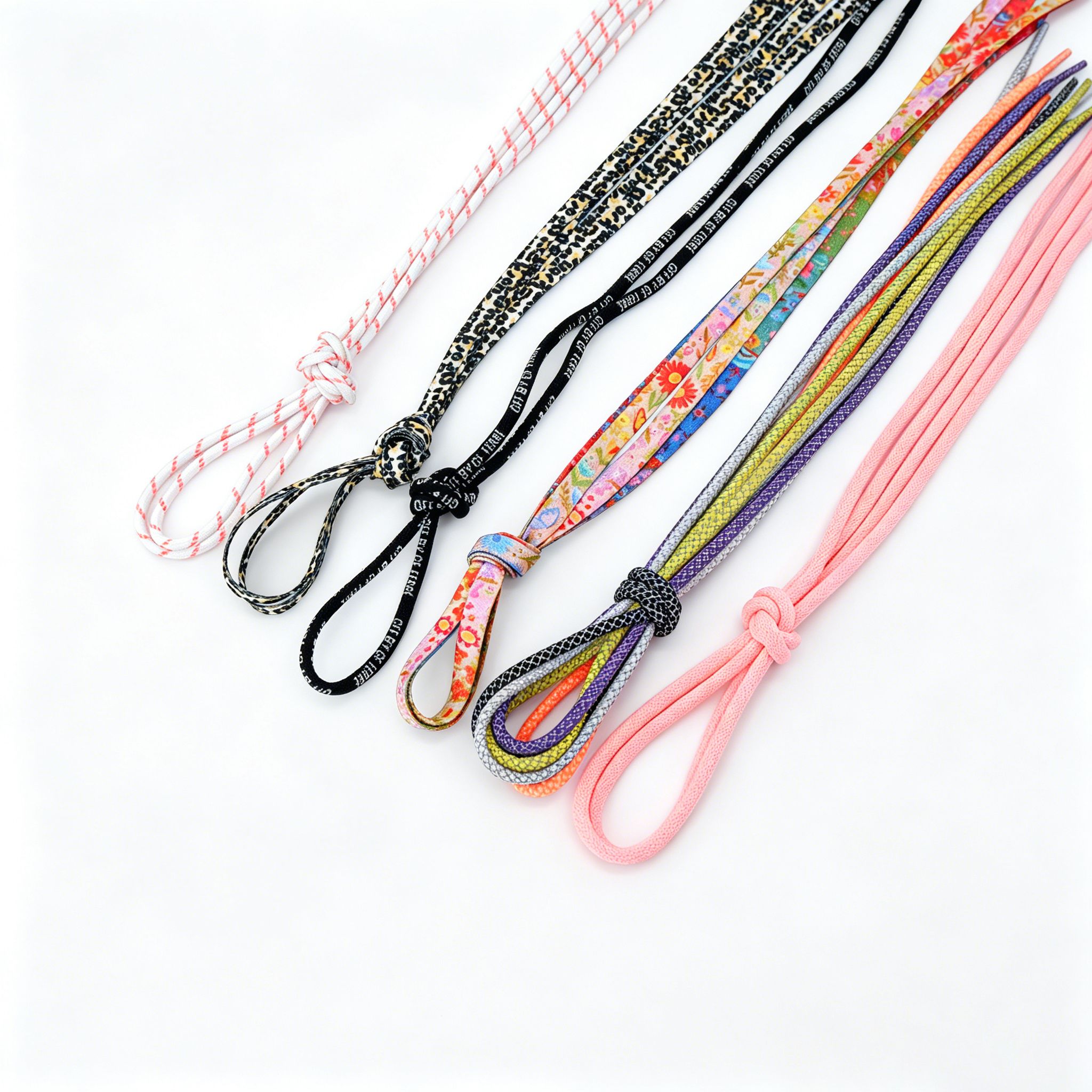
A badge rarely starts with the face or the lettering. It starts with the slab of metal underneath. Brass carries a dull warmth that softens scratches instead of broadcasting them, while nickel silver stays cooler to the touch and holds a crisper line around letterforms. Those differences show up after the first hundred wears, when edges soften, plating thins at the high points, and the material underneath decides whether the piece looks lived-in or simply tired.
Weight matters just as much as appearance. A slightly heavier alloy keeps the badge from shifting against the chest, so the pin back isn’t doing all the work every time the wearer reaches across a desk or leans into a car window. Zinc-based casts can reproduce fine detail at a lower cost, but they flex differently under pressure and tend to show their age in a chalky way. Choosing the right base metal is less about holding the badge together and more about controlling how it behaves across a long, unpredictable day.
The finish adds another layer of intent. Polished areas catch overhead light and draw the eye toward the seal or name, while matte recesses give the raised elements room to breathe. When the plating is chosen with the base metal in mind, the whole surface wears as one rather than peeling at the edges. That kind of thinking turns a simple identifier into something that feels deliberate in the hand and on the uniform.
Hardware Accents That Give the Design a Point of View
Hardware isn't just the finishing touch—it's the quiet signature that tells you how a piece wants to be seen. Unlacquered brass pulls that darken with every grip, oversized industrial hinges left deliberately exposed, or a single sculptural knob that breaks the symmetry of a row of drawers all steer the eye and the hand. These choices lean into contrast: soft matte black against pale oak, polished nickel catching hallway light against a moody wall, or raw iron that feels almost architectural. They carry a point of view without needing to raise their voice.
What makes hardware feel intentional rather than off-the-shelf is how it responds to the surrounding material. A chunky lever handle on a slim slab door can shift an entire room from expected to editorial. Mixed finishes done with restraint—brass paired with oil-rubbed bronze, or chrome beside aged steel—create a collected-over-time texture that reads as personal, never accidental. The scale matters too: a long, bar-like pull on a tall cabinet draws the eye upward, while tiny turned knobs on a low media console invite a slower, more tactile interaction.
Designers often use hardware the way a tailor uses buttons on a custom jacket—not merely functional, but as a deliberate punctuation of the whole silhouette. When every hinge, catch, and pull feels chosen for that specific place, the design stops being a collection of panels and becomes a point of view you can literally put your hand on.
Color Blocking That Feels Like a Brand Signature
Some brands use color the way others use a logo — repeated so consistently it becomes a shortcut for recognition. Think of the deep lavender that instantly calls one beauty label to mind, or the burnt orange that makes a homeware catalog impossible to mistake. The trick is restraint: one or two signature shades carry the weight, while everything else stays quiet. This isn’t a palette, it’s a personality trait.
When the same color blocking appears across packaging, campaigns, and store design, it stops feeling like a styling choice and starts feeling like handwriting. A bold sleeve of cobalt on a book cover, a stripe of acid green on a sneaker, a matte chocolate band on a skincare bottle — these details signal who made it before a logo ever shows up. Repetition without monotony is the key, letting the color move to different placements while the contrast stays familiar.
What makes it stick isn’t loudness but consistency of contrast. A signature block often works by breaking a neutral field with one saturated, unexpected zone — and then refusing to apologize for it. Over time, that interruption becomes the brand’s visual voice. Customers learn to spot it from across a subway platform or a crowded shelf, proving that color, when treated as a structural element rather than decoration, can carry as much identity as any wordmark.
Fit and Movement for Long Days on the Floor
By hour six on a concrete slab, a pair of pants that felt fine standing up usually tells you the truth. The front waistband digs when you kneel, the back gap opens when you reach, and the knees creep up your shins. A fit built for floor work keeps the rise a touch longer in back, uses a gusseted crotch, and shapes the legs so they don’t stack behind the knee when you sit back on your heels. None of this shows much in a mirror. You feel it the first time you work low without yanking at the fabric.
Movement is where that fit either holds or fails. Fabrics with controlled stretch give with a lunge but recover instead of bagging out by mid-morning. The wrong stretch, especially around the knees and seat, turns into folds that pinch under a knee pad. Seams should land away from pressure points; that means flat-felled or low-profile stitching across the hips and inner leg rather than bulky double rows down the front of the thigh. Small shifts like a higher back pocket or a lower cargo flap also stop tools from pressing into bone when you shift weight sideways.
The real test is repeated motion: kneel, crawl, stand, kneel again. If the hem catches under your boot or the waistband needs retying after every trip up, the cut is working against you. The best floor-day gear disappears once you settle in. You stop adjusting, stop tugging, and just move.
Subtle Details That Make the Lanyard Worth Keeping
The stitching along the edges doesn't just hold the fabric together—it sits flat against your neck without that scratchy ridge most lanyards leave behind. Run a thumb over it and it feels almost broken in from day one, like a keychain you've had for years. Even the plastic buckle clicks with a low, solid snap instead of that hollow rattle you get from cheaper versions.
What you notice over time is how the colors hold. The navy stays deep after weeks of sunlight and hand sanitizer, and the logo doesn't crack into tiny islands the way printed ones do. It's a small thing, but when you reach for your keys in a dark hallway, your fingers find the slightly textured weave before your eyes do—a quiet detail that keeps it from feeling disposable.
There's also the matter of length. Not so long that it swings into your coffee, not so short that you have to tilt your chin to scan a badge. The ring attachment sits flat rather than twisting sideways, so your keys don't end up in a tangled knot. After a month, you stop noticing it entirely—which is exactly why it works.
FAQ
An ODM fashion lanyard usually combines custom material development, structural design, and hardware selection rather than relying on a single printed polyester strap. The result tends to include textured weaves, tonal details, shaped ends, or mixed material accents that make the piece feel like part of a style system instead of a functional afterthought.
Small repeated motifs, brand colors placed along the edge or on hardware, and a well-chosen font on a debossed tab can all carry identity quietly. The goal is to make the lanyard easy to wear with casual outfits while still instantly recognizable to someone familiar with the brand.
Matte metal components, reinforced stitching around attachment points, a soft-touch woven surface, and a clean finish at the ends tend to register immediately. Even a subtle change like replacing a plastic buckle with a slim metal swivel hook can shift the entire impression.
A dense recycled PET or brushed polyester weave gives a soft hand feel and holds color well. Adding small leather-look accents or a silicone logo patch can add depth without making the strap stiff or heavy, and a contoured width around three-quarters of an inch usually sits comfortably on the neck.
Yes, a breakaway can be integrated near the back of the neck or via a slim side-release buckle that blends with the overall line. Choosing a muted material and matching the buckle color to the strap keeps the safety function discreet without interrupting the design.
Hardware often sets the tone. Brushed or matte finishes in gunmetal, nickel, or soft gold, paired with cleanly shaped clips and key rings, give the lanyard a more intentional look. Oversized or shiny plastic connectors tend to lower the perceived quality even when the strap itself is well made.
It helps to share visual references, color direction, and how the lanyard will be used, then stay involved at the sample stage. A good ODM team will translate that into material combinations and construction details, but the brand should still review physical samples for drape, hardware finish, and overall comfort before final production.
Conclusion
Most lanyards get treated as an afterthought, but ODM approaches them as a compact brand surface that happens to carry a badge. Instead of defaulting to shiny polyester, the range leans into textured weaves, matte finishes, and softer edges that read more like an accessory than a staff necessity. Hardware is chosen the way you would pick buttons for a jacket, with brushed metal ends, slim safety releases, and occasional matte black clips adding a clear point of view without turning loud. Color blocking also avoids random contrast. Bands are built around two or three repeatable tones, so a lanyard becomes a small, walkable signature rather than a generic giveaway.
Comfort gets the same attention as appearance. The strap width, neck curve, and hardware weight are adjusted for people who wear them through long shifts, so the lanyard sits flat and moves quietly instead of twisting or biting. Small details do the retention work through a discreet silicone grip, an easy badge orientation point, or a subtle woven label that gives people a reason to keep it after the event ends. That combination of restraint and utility is what makes ODM fashion lanyard designs feel less like promotional extras and more like part of a uniform someone actually wants to wear.
Contact Us
Contact Person: Bill Huang
Email: [email protected]
Tel/WhatsApp: 8613829102720
Website: https://www.dclanyard.com